November 12, 2023 | Digital Strategy | SEO Content |
Welcome to the digital age! It’s almost 2024 and you’ve decided to implement a new design for your website to ensure you reach those on the go with mobile. And why not? According to Pew Research, over 90% of adults in the U.S. own a smartphone, a sizeable increase from the 34% who owned on in 2011. For many, it’s their preferred device, especially those between the ages of 16 to 34.
Companies with mobile optimized websites get 39% more sales than companies who don’t
Make no mistake, users will go between mobile and desktop when the need arises. 1.7 billion transactions are done through both desktop and mobile sites every year. If you’re looking to target businesses, your brand needs to ensure you’re targeting them both on computers and mobile devices.
Your first digital impression should be your website. But not all websites work on mobile and for some companies, they just create a separate mobile site to work with the variety of different phones and screens. Some companies don’t bother with any site and just use an app.
So what’s right for your brand’s website? Should you design a responsive site, a mobile site, or create a mobile app? Is one better than the other? What exactly are the differences?
Nearly 80% of internet usage will be done on mobile by next year
As mentioned, 1.7 billion transactions happen through both desktop and mobile devices every year and many millennials and generation X members count their smartphones as their preferred device. Mobile accounts for approximately half of web traffic worldwide. In the last quarter of 2023, mobile devices (excluding tablets) generated 58.67 percent of global website traffic. Mobiles and smartphones consistently hoovered around the 50 percent mark since the beginning of 2017, before surpassing it in 2020.
Mobile definitely matters.
So you know mobile is kinda a big deal and you don’t want to be left behind, but what’s the better approach? Let’s discover what each of these things are and what they can do for your brand.
Let’s look at responsive web design first.
While relatively new, RWD isn’t the first time companies have had to change the way their websites are viewed on a computer screen - back in the mid-2000s, larger monitor sizes posed this same issue for websites, where a site needed to accommodate for both the standard 800x600 screens and larger screens that went up to 1260x1024.
SEO on RWD sites rank higher in Google search
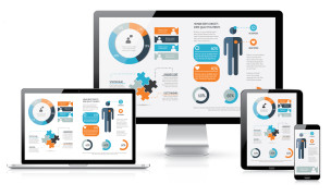
Currently, many new websites are designed in the new HTML5 and JavaScript, which allow for better flexibility when it comes to user interaction. The greatest benefit of RWD is that it’s designed to match any size screen, regardless of device – that means your website will look the same whether your potential customer is viewing it on their desktop, their tablet, or their smartphone.
Other pros to using RWD are:
These statistics provide a window to users' minds, allowing businesses to understand their preferences, habits, and interactions.
Depending on your brand and what you sell, you could easily get away with users just interacting with your app instead of your website.
Hybrid apps are especially popular, as it means users who have several differing devices – like an Android smartphone, an iPad or tablet – can use your app across all of their devices with a single sign in. Your brand doesn’t need to go cross-platform, however – if research shows your base are more Android than Apple users, you can design native apps for just that platform.
Other pros for having a mobile app are -
There are, of course, cons to opting for mobile apps. A big one is not being accessible on every device – should you cater to the iPhone crowd? Or throw your support to Android? What about users still using Windows phones? Of course you should go where your customers are, but what if new customers aren’t using the same device OS?
There’s also the downside of not having any flexibility. Getting an approved app within any of the app stores is a process, that can sometimes take days even weeks to complete and that’s if they get the seal of approval; if they don’t, that means going back to ensuring that your app meets their requirements.
Not only does this take time, but it can also be costly. Not only the development of the app, but marketing and SEO, which will be different from that of the website.
Mobile sites are similar to RWDs, though in many cases, they will have a different URL than their parent site. These are called ‘m.sites’ or ‘m (dot)’ and while they are still in used today, they are starting to be phased out in favor of responsive web design.
There are pros to having both a main website and that of a mobile site –
The biggest con to m.sites is they just aren’t as popular as compared to a mobile responsive site or an app. These sites were mainly designed when cell phones and smartphones started to become popular, but haven’t been anything noteworthy since about 2013.
There are cons to having both a regular website and a mobile, including having multiple URLs that users will have to remember, needing to maintain two websites, and a bigger concern of not being compatible for all devices. Does your mobile site only work on touch screens or does change when a keyboard is added to a device?
So which of these things are better? The answer to that question really depends on your business and business goals.
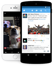
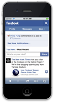
There’s no reason why your business can’t have a RWD and a mobile app, especially if you want to utilize notifications or in app purchases; many businesses have all three – social media platforms, just as Facebook and Twitter, have their main websites, mobile sites, and native mobile apps.
If your goal is to obtain more visitors to your website, going the RWD route might be beneficial, as you’d still be able to reach mobile customers as well as those using the desktop site. If your business and its goal is to better entice online shoppers, having both a website and a mobile app would capture those customers.
Amazon is a great example of this, as their RWD site works on both desktops and mobile, however their mobile app allows greater and easier shopping options on smartphones and tablets.
A RWD is definitely the first place to start to ensure that your site can be accessed on any device. From there, you could use analytic tools to see insights on what your customers are using when they visit the site – do you have more Android users than Apple users or is it a mix? Do customers often head toward your product section, but don’t make a purchase? Perhaps a mobile app is an option to consider.
If you aren’t sure where to start or have questions, our Data Analytics and Development teams can help point you in the right direction. Contact us and tell us how we can help.
Tell us your interests and preferred contact method below. Our team will reach out within 1-2 business days.
© 2025 Change3 Enterprises LLC - All rights reserved | Privacy policy | Email Opt-Out

